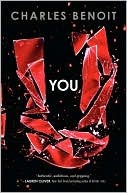
 Charles Benoit's Young Adult debut, You, earned this praise from Publisher's Weekly: "Disturbing content blends with skillful, fast-paced writing, adding a thriller spin to the novel's vicious realism." Count me in! And that cover? Shattering. Here's Charles to tell the tale of how it came about:
"I didn’t think about a cover until after the book was done because frankly I didn’t think I’d see it published. It’s dark, which is a good thing, but it’s told in second-person and every author knows that that is simply not done. It was only when Harper Teen bought the rights that I allowed myself to imagine a cover. The first idea I had was along the lines of the cover for Blink by Malcolm Gladwell (below) – clean, white, in a lower case Helvetica-esque font. But the more I thought about the book, the darker my imaginary cover became until it was all black with a white typeface font.
"In addition to writing novels, I work as a Senior Copywriter and Producer for Dixon Schwabl, an ad agency in Rochester, NY. Every day I participate in brainstorming sessions as the art directors work to come up with visuals for the various campaigns. I’m smart enough to restrict myself to high level suggestions and let the visual experts take the lead. I did the same with my cover ideas for You. I told them I saw something dark and text-driven – no cover image, just a few simple words to mirror the simplicity of the title..."
Read the rest of Charles's Cover Story at bn.com's Unabashedly Bookish.


3 comments:
So much about this book is powerful! Plot, cover, uniqueness of the second-person point of view...quick, worthwhile read.
This book floored me. Read it in one sitting. Totally unputdownable.
Post a Comment